Posts

Showing posts from 2010

Why I Don't Paint Snow

Image
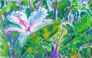
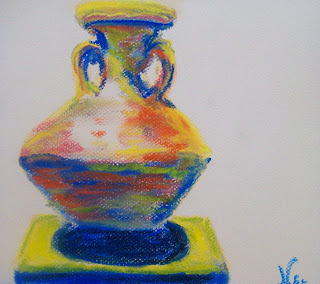
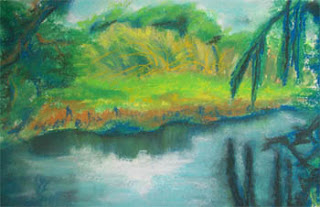
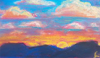
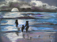
It's winter time, and after about five straight days of rain, it's tempting to look for something "winter-like" to paint. I see all of the beautiful holiday art, with snow covered cabins and silent forests, and wonder why I have no inclination to paint such things. I think my family and friends could probably explain it. Anyone who's known me for a period of time knows "Niki hates snow!" For the record, I think snow on distant mountains is pretty. Even that lost its appeal for a while; as a teacher at a school in a wind corridor beneath the San Bernardino Mountains, I spent many a miserable recess period out on playground duty, freezing as the wind whipped down from the cold snowy mountains. Snow to me means miserable wet and cold and the opportunity to fall on my butt-- and that's about it. I did try to paint a winter scene in an art class, and it looked like a bad attempt at a Thomas Kinkade imitation. I may try one again in the future, but for now

Dark toned Strathmore: a striking backdrop

Image
I've gotten pretty fond of my Strathmore plum-toned pastel paper. When I first began using chalk pastels, I was afraid of the darker-toned papers. I knew that I would have to keep a cool head while using them, because the whole point of dark paper is to add striking lights to create your painting while leaving the tone of the paper as one of the values. This means using restraint, which is not something that comes naturally to me. Since I've had trouble concentrating lately, forcing myself to stick to a simple subject with limited use of color gives me a good set of guidelines as I work. This is why I turn again and again to Ancient Egyptian pottery-- I can focus on shapes, lights, and darks, without getting too emotionally attached to what I'm painting. Art should be emotional, right? For me, not always. Painting with my head rather than my heart is good discipline, and usually produces a nice result. I called this piece "Majestic," because this particular pot ha

Discovering Fingerpainting

Image
"Pretties for Kat" 8 x 11 Watercolor and Pastel on Paper We started with the usual materials... taped down paper, watercolors, a tiny bit of water and a couple of brushes. I've been thinking lately about why I don't use the paints and brushes as often anymore, and it's most likely that for me, the brushes get between the direct connection between medium and paper. My toddler made this discovery last night. I began to swirl the paint around the paper, blocking in some floral shapes. My daughter made a couple of her own swipes with the brush, but lost interest quickly. She began to dip her fingers in the paint itself, and spent the rest of the time happily dipping and dotting, trying out each color for herself. Normally, clings to my side, but this time she was so absorbed in her painting that I was able to walk away and let her finish up on her own. So, I finished the work by myself, letting the watercolors dry and blocking in some bright chalk pastels later. I wa

Another Big Flower...

Image
"Reaching Out" 12 x 18 Pastel (oil and chalk) on Paper Click here to buy print: http://www.redbubble.com/people/nikihilsabeck/art/6423935-1-reaching-out-pastel Another big flower... another mixture of oil and chalk... Same subject, different day? How is it that painting in a series can be comforting, yet challenging? And is it still considered a series if you take a break and paint something different for a while? I'm not sure I would call anything I paint a "series," except maybe my Egyptian-inspired pieces. Yet, these large flowers call to me often, as does the need to paint them in oil and chalk. I'm not sure it's the subject matter and medium I crave in these cases, though. I think it's the escape into painting without having to plan too much, or worry about perspective and straight lines, or about capturing a likeness. It's the freedom of painting loose, with a general destination in mind, but absolute freedom in how I reach it-- and absolu

Canson Watercolor Paper-- Still Haven't Used it for Watercolors!

Image
"Winter Meeting" 12 x 18 Chalk Pastel on Paper Click here to buy print: http://www.redbubble.com/people/nikihilsabeck/art/6417412-1-winter-meeting-pastel Click here to see more of my animal themed art: http://artbynikihilsabeck.blogspot.com/p/fauna-i-animals.html I tried this subject earlier on a small piece of paper, and between the tiny size of the paper and the bluntness of the pastels (I don't use the pencils too often), there just wasn't enough room. I've always liked this idea though-- birds at sunset in Oceanside, California, on one of those winter days when there are more birds than people on the beach. So, I decided to give it another try with large Canson watercolor paper and "winter" colors, which for me are gold and purple (at least at the beach!) Instead of trying to realistically copy the photo, I went for a looser approach, and did only a little smearing at the end. I tried to keep the colors in the water broken, with harder edges, and the

Painting Fast and Loose with Pastel (Egyptian Jug)

Image
"Egyptian Jug" (9 x 10.5 Chalk Pastel on Paper) Click here to buy print: http://www.redbubble.com/people/nikihilsabeck/art/6412843-1-egyptian-jug-pastel There are three big reasons I love using chalk pastels: bright colors, versatility, and convenience. I've been having trouble getting myself to the paint board lately, and when I do, I have trouble liking what I see when the work is finished. I'm finding that the more difficult and complicated life gets, the more stripped down and simple the subjects I am painting... For this piece, I took a piece of lightly toned Canson Mi Teintes paper (9 x 12) and made a light sketch of the shapes I wanted. In order to focus on what I was painting, I turned the reference photo and paper upside down, offering my right brain a chance to take over. I don't like to get too dependent on this trick, but I figured it would take my mind off the barrage of problems I've been worried about. It worked, and I got the basic shape down

Mixing media and ancient pots

Image
"Pair of Pots" 15 x 20 Mixed Media on Paper Click here to buy print: http://www.redbubble.com/people/nikihilsabeck/art/6345135-1-pair-of-pots These two little Egyptian pots looked so cozy together, I had to create a piece just for them. I've been trying to stick with working big as often as possible, as it's more enjoyable than agonizing over small details. I started with an acrylic painting in pink, purple, and white to show the values. Once the paint dried, I added some chalk pastel to show a little more color and neutralize the background. I've used this combination in the past and enjoyed it, although the acrylic does tend to eat up the chalk pastel (useful if you want to get a nice flat side on any of your chalk, I suppose). The finished product was awfully dusty, though, and lacked any areas that "popped." A little blending with one of those craft sponges lifted off some of the dustiness, but didn't entirely solve the problem for me. I decided

Happy Accidents (experimenting with pastel techniques)

Image
"Standing Alone" 12 x 18 Chalk Pastel on Watercolor Paper Click here to buy print: http://www.redbubble.com/people/nikihilsabeck/art/6334869-1-standing-alone-pastel It was that time of night where I was tempted to just call it a day and get some sleep, but felt guilty because I hadn't painted yet. Lying on the floor with my feet by the heater, I grabbed my chalk pastels and a large piece of Canson watercolor paper. I find it helpful to tape paper down on some type of board earlier in the day, so I have one less excuse to get out of painting. I figured I would work large and simple, use complementary colors, and toss the piece out at the end if I didn't like it. I used one of my photos of a simple, beautiful Egyptian pitcher as a reference. I didn't have much in the way of light, which also freed me from agonizing over details. I worked quickly, and had a complete (first stage, anyway) painting within a half hour. I finally felt justified in drifting off to sleep.

Back to the big paper... make it Canson Watercolor

Image
"Clearing" 12 x 18 Pastel on Paper Click here to buy print: http://www.redbubble.com/people/nikihilsabeck/art/6314102-1-clearing-pastel I used to have a brave motto for myself when it came to painting: paint big or go home. If I had to resort to something as small as 9 x 12, it was because I was out of the bigger stuff. In recent months, particularly once I began painting regularly, I've had to cut my paintings down in size. Between time constraints, tiredness, and lack of space, I could only go for the big paper or canvas when I got the rare opportunity to spend a few hours painting at a time. Painting small has its benefits-- it takes less time (in theory at least), and doesn't require as much energy for me to cover the paper with the media. It has a big drawback for me too though: I end up painting much tighter than I originally intend to, and end up squinting over that small paper or canvas, trying to get my details straight. With this issue in mind, I recently b

I see Arches Cold Press in Your Future...

Image
"Esmeralda" 9 x 12 Chalk Pastel on Paper Click here to buy print: http://www.redbubble.com/people/nikihilsabeck/art/6277001-1-esmeralda-pastel I've always had a fascination with gypsies (or at least their outfits)...one of my favorites is Esmeralda, the fortuneteller in the machine in front of the arcade at Disneyland. She looks especially interesting at night, with all of the lights around her. For this piece I broke out the Arches Cold Press watercolor paper-- I enjoy blending the chalk pastel with water, and this type of paper really lets that combination shine. I blocked in my painting with strong pastel strokes, using bright colors. Instead of smearing with my fingers, as I usually do, I used a brush and a small cup of water. I learned this time that it's best to use a stronger brush-- the brush I was using was made for Chinese caligraphy, and not at all helpful with the "bubbles" that formed when the water hit the chalk. Still, a little patience went

It's All in My Head (painting from imagination)

Image
I don't normally paint from imagination...it's hard to stay "on topic" if I don't have a clear reference as a reminder of what it is I wanted to paint in the first place. One of the things that helped me stay focused in this case was to make a thumbnail sketch as a guide. I used to paint from imagination all the time, before I began taking art classes. It was frustrating to ind that what was in my mind never quite matched what came out on paper. In fact, it rarely even came close. Now that I have a few years of painting practice under my belt (and know a lot of special tips and tricks), I feel ready to occasionally try something from pure imagination again. One of the things I enjoy seeing (and am spoiled enough to see often) is a beautiful sunset. Of course, it's not always practical for me to run out and try to paint the sunset-- it changes pretty quickly (and don't get me started on the gnats!) Occasionally I'll take a picture of one, but the t

Another "Wild" Night (Painting Wildflowers)

Image
"Pretty Wild" 9 x 12 Pastel (oil and chalk) on paper Click here to buy print: http://www.redbubble.com/people/nikihilsabeck/art/6227032-1-pretty-wild-pastel I'm finding it quite therapeutic to paint random scenes from nature these days (in my usual messy fashion of course). What turned me off to a lot of these types of scenes initially was that I didn't want to get caught up in all of that detail... so many leaves, branches, petals, etc! I've since become comfortable focusing on emphasizing just a few details, and making the paintings mostly about the texture, patterns, shapes, and colors. It's important to work the whole painting at once, rather than get sucked into making each area perfect before moving on to the next. I started this one with the oil pastels, using dark blue and purple to map out the main shapes for the branches and larger flowers, and then adding in the overall patterns of flowers and leaves. I tried to detail a few leaves or flowers, just

Fast, loose, and small (a quick daily painting)

Image
"Boy" 6 x 6 Chalk Pastel on Paper Click here to buy print: http://www.redbubble.com/people/nikihilsabeck/art/6209146-1-boy-pastel I had a little 6 x 6 piece of black Canson paper left, and I was feeling portrait-ish. I didn't feel like getting trapped in the realistic painting vortex, so I flipped through my Egyptian museum photos. One of them has many figurines in it, and all I could see was the head of shoulders of what looked like an Egyptian boy. I used a pink-orange tone to start, and added bright yellow and green blue to finish the shape of the quick sketch with the pastels. So how did it end up so blue? I began smearing (my weakness) and adding a touch of black and lots of dark blue. As I smeared and highlighted, the shape of the boy's head and shoulders rose from the p

Full- Tilt Pitchers (stylizing objects with pastel)

Image
"Egyptian Pitchers" 9 x 12 Chalk Pastel on Paper Click here to buy print: http://www.redbubble.com/people/nikihilsabeck/art/6190856-1-egyptian-pitchers-pastel I liked these pitchers, and wanted to paint them. I was having trouble getting started because they looked so... orderly. Upon closer examination, I noticed that the necks on a couple of them tilted at a slight angle. This made them a little more interesting, and gave me an idea-- why not exaggerate the tilt to make them more fun to look at? So, instead of trying to faithfully render the pitchers, I rearranged them a little and increased the tilt on some of the lines. I was enjoying the effect of the extra soft pastels on the toothy dark paper, and wanted to keep some of that soft light, so I left those areas alone. The original pitchers were all pretty neutral in color, so I added some brighter colored accents and complementary colors to liven them up. I always think to myself that if I had a little more control and p

Trapped in the vines (painting flowers)

Image
"Entangled" 9 x 12 Oil and Chalk Pastel on Drawing Paper Click here to view listing for original For prints and cards, click here: http://www.redbubble.com/people/nikihilsabeck/art/6112438-1-entangled-pastel I've never been too excited to paint flowers just for the sake of making pretty flowers-- I usually need something a little more interesting about the flowers to inspire me. In this case, I was intrigued by these pink flowers who seemed to bloom despite the mass of vines around them-- they appeared somewhat trapped. It reminded me of how I feel sometimes, tied to so many things in life that I have little free time anymore. Yet, I know that if these flowers were cut and freed from the vines, they would wither and die. I think people are the same way-- for all the pressure we feel from our surrounding ties, we would not survive if we were cut completely free from those ties. To paint this piece, I bloc

Boo! It's another black cat.

Image
"Nap, Interrupted" 7 x 12 Chalk Pastel on Paper Click here to buy print: http://www.redbubble.com/people/nikihilsabeck/art/6060579-2-nap-interrupted-pastel Another little chalk pastel painting of a little black cat... this one was done on black paper, with blue and orange tones to show the fur patterns and highlights. I had to break down and add some black pastel as well, because the paper itself wasn't dark enough. I left a little of the black paper for the "lighter" areas. This was another case of the eyes being the most important feature-- especially on a black cat, since it's so hard to see their other features in pictures and artwork. I figured this was a good time to paint black cats. I have so many great pictures that lend themselves to fall artwork, it's hard to k

Post #50: Painting Loose

Image
There are times when I want to paint a little more realistically, or I have a definite image or concept in my mind that I want to explore. And then there are times (like last night) where I'm so tired, I don't know what it is I want to paint. Add to that my personal need to vary my subject matter and approach every few days, and it makes for some frustrating late night decision-making. I knew I wanted to stay away from focusing on a single object (or pair of objects). I thought I might try a place, only I didn't have a clear idea of what I would like to represent in my painting. Then, I sat down in front of my pastels-- the extra soft chalk ones-- and noticed all the beautiful greens. I don't get around to painting much with green, having somewhat of an addiction to blues and purples. I remembered a photo I had taken of a small forest in Germany, which was almost entirely green. I decided I would try it with the oil and chalk combination, and began blocking in grass and

That Cold Fuzzy Feeling (more on how to combine oil and chalk pastels)

Image
My first month in Germany provided me with a lot of opportunities for culture shock-- I think one of the strongest impressions I still remember was my first glimpse of what was once an East German town, but had become part of the newly reunified Germany. I've been to L.A. many times, and I've never seen air as dirty as what the people in that town were breathing. Everything had a grayish-brown tint to it, and the dominating figure in the town was a factory with a tall smokestack. The tower in this painting was on the outskirts of the town, and I took a picture to remind me of the up-close view. To create the abandoned look in this picture, I colored the tower in first with the orange-peach tone (oil pastel). I then blocked in some of the blues and darks (again with oil pastel). Once I had the basic shapes and values in, I went over the picture with chalk pastel, smearing it in as I went. For this piece, I did a lot of layering and scratching-- the underlayer of oil pastel allo

Fire-Breather (Abstract colors, or a dragon?)

Image
Painting again with my little mini-me, we stuck to the bright colors in the initial watercolor. She even stomped on it with her little feet, which led to some worrisome scrubbing later during the clean-up time-- I was afraid the red paint was something else. She scrawled in some shapes with the watercolor pencil, which I began to fill in with paint. She also added her own paint and water, and as the forms emerged, it began to look a little dragon-like. I decided to call it "Breath of Fire." I wanted to keep it abstract, though, so I didn't fill in lines to identify an actual dragon. My favorite part of the picture is the part with the two little red dots at the bottom-- they were from my daughter's brush, not mine. "Breath of Fire" 9 x 12 Pastel and watercolor on paper Click here to buy print: http://www.redbubble.com/people/nikihilsabeck/art/6018887-1-breath-of-fire-pastel-and-watercolor

Homeward Bound (Kayaker at the end of the day)

Image
"Homeward Bound" 6 x 12 Pastel on Paper Original sold Click here to buy print: http://www.redbubble.com/people/nikihilsabeck/art/5989191-1-homeward-bound-pastel I was sure I would experience more bad karma with this paper... I bought the paper at a large creative supplies store, which shall not be named here. I was irritated because they no longer have the plain old block of cheap Strathmore art paper, so I bought some extra large pieces of toned paper for pasteling (Canson). When I got to the register, the cashier started to roll up the paper, and I snapped at her to leave it flat. Normally I try not to snap at anyone doing his or her job, so I felt guilty-- and the bad karma from that incident has been following this paper. It's taken a beating with some wrinkles and water drips, and has narrowly missed several cat and child-related mishaps. I promised myself I wouldn't snap at a cashier aga

A Writer with a Painting Problem (written reflections on art)

One of the things I like about Red Bubble is that it supports writers as well as visual artists. Writing comes out in all areas of my life-- I enjoy both creative and communicative writing. Writing is much easier than talking, because I get the chance to carefully edit what I'm saying. It also leaves little room for selective hearing or misinterpretation, since everything is right there in print. So, I'm adding a new page: A Writer with a Painting Problem (click here to view): http://artbynikihilsabeck.blogspot.com/p/writer-with-painting-problem-written.html I'll be updating this page with links to my Red Bubble journal or any other pieces of interest I write as I progress as an artist. If you're a writer, you know that you spend an awful lot of time avoiding the actual sitting down and writing part. So really, I should be doing more writing instead of all this painting-- which is why I consider myself a writer with a painting problem-- I keep picking up the paintbr

Painting a Pet Portrait

Image
"Sourpuss" 8.5 x 10.5 Pastel on paper Click here to buy print: http://www.redbubble.com/people/nikihilsabeck/art/5982190-1-sourpuss Pet portraits, like people portraits, have a big pitfall: if you're painting an image of a person or animal you know well, your left brain is always whispering in your ear-- telling you that your portrait doesn't match up with the real thing. I wasn't even going to make this an actual pet portrait-- I just wanted to paint a stylized white and pink cat on a blue-green background for fun. Once I started blocking in the chalk, though, it felt wrong not to match her face up with the real thing, since I was using this cat as a model. It might have something to do with that accusing stare, which she shares with just about everyone she meets. I took a wildlife painting class some years back, and the big thing I took away from it was that the face gives the animal its personality. To get the face accurate, you have to turn off that left brai

Toddlers and Cave Painting...things artists don't have to worry about today

Image
While painting again with my toddler, I started thinking about how much different life must be for artists today compared to those who created early cave paintings. "Lockin' Horns" 9 x 12 Watercolor and Pastel on Paper Click here to buy print: http://www.redbubble.com/people/nikihilsabeck/art/5934557-1-lockin-horns We have the luxury of bright light whenever we want it, as long as the electricity is functioning. We can paint in a comfortable environment at pretty much any time of day and year, if we have the convenience of a mild climate or a thermostat. We can paint on just about any surface. Our colors come out of a tube, ready made and pre-mixed if we want them to be. We can share our works worldwide, thanks to the internet. Best of all, I can sit on my kitchen floor and swirl paint around with my little girl, and there's no pressure to do anything but enjoy the experience-- and, I don't have to worry about being eaten! Started the painting above with watercolo

Creating an image-- toddler style

Image
"Jewel Bug" 9 x 13 Pastel and Watercolor on Paper Click here to buy print: http://www.redbubble.com/people/nikihilsabeck/art/5917275-1-jewel-bug Well, my little one has figured out that pencils make all kinds of interesting marks. I taped down some watercolor paper and handed her the paint board, and she immediately took a watercolor pencil in hand and began scribbling. The scribbles looked like branches to me, so I dipped the brush into the paint and sketched in some purple branches. She continued to add scribbles with her pencil, then swapped the pencil for the paintbrush (she gets pretty irritated with me if I don't let her take over with the brushes). I continued to work around her marks, and got something that looked like a crawfish on a branch as a result. Her attention span is pretty short, so once she turns her attention to smearing the water all over the floor, I usually add the finishing touches and let it dry. Later, I went over the painting with a heavy layer

Flamingoes at the Wild Animal Park (Keep those drawings on deck)

Image
"Mingoes" 9 x 12 Pastel on Paper Click here to buy print: http://www.redbubble.com/people/nikihilsabeck/art/5912653-1-mingoes-pastel I always avoid the flamingoes-- they're noisy and they STINK! Of course, they're beautiful to look at. I managed to find a couple on their own, where the smell was a little less vile. I've never been particularly interested in these birds, because their images are used so often in the cheesiest of venues: dive bars, a Vegas hotel, bad tourist shirts. These two, however, strutting quietly through the water and taking an occasional drink, provided a much more dignified representation of the bird. Their necks make the most graceful shapes. Really, they can be just as pretty as swans, once they're away from their noisy friends. I originally did this picture on toothy pink Strathmore "art paper" with a china pencil. The paper was so textured, however, that it ate the china pencil and took away from the lights and darks of t

Canopic Jars (Dust them off and try again)

Image
This was a lonely-looking canopic jar in the original photo. In my first version, I ended up with a pretty dark painting-- cold light, warm shadow. I wasn't thrilled with the result, mostly because I was distracted by a crying toddler while I painted. Even though she was upstairs in another room, I had trouble tuning her out, and kept rushing my work so I could stop her crying (as moms are prone to do). I went back and noodled it a little, but I wasn't totally satisfied. So, I decided to try it from a different approach. I know that many people tend to imagine everything in Ancient Egypt as cold, dark, and dusty, since that's how the things they left behind look today (you would too, if you'd been sitting in a tomb for thousands of years). However, they lived in the constant bright light of the desert sun, and must have used bright colors in their creations too. I decided to make the brighter version to liven it up a little, and boy did it ever! I was much happ

Hot Air (painting hot air balloons with pastel)

Image
Although I enjoy the wine and the food, the real reason I want to go to the Temecula Wine and Balloon Festival every year is to see the balloon glow-- and take pictures of something you don't get to see too often: hot air balloons lit up against the backdrop of night. I've been painting some of these hot air balloons off and on for a few months. I've painted them with acrylic, mixed media, and plain old chalk pastel. It's difficult to strike the balance between the bold lights against the dark night with the soft shapes of the balloons. I found that if using a medium like acrylic, I needed to keep it extremely loose and keep the shapes simple. I need to keep the focus on basic shape, light, and dark, and leave out the details. This makes for some abstract-looking balloons (see below, left). "Night Balloons in Temecula" (left) "The Pechanga Balloon" (Right) On the other hand, having recently grown more comfortable mixing the oil and chalk pastels, I

Trying to get off the blue stuff...varying use of color

Image
I was beginning to suspect that blue was becoming my go-to color in all of my work-- I tend to use a lot of color complements, so if I pick up the blue, that attaches me to orange. It's just that it seems that blue is everywhere I look-- black, gray, even white often looks blue to me. I should have seen this coming; as a child, I colored all of the models' teeth in my mom's magazines blue, because I thought blue teeth looked prettier. I knew there was a problem when I glanced through my Red Bubble favorites a few days ago, and noticed I had selected almost exclusively blue-based pictures. I had also completed a monochromatic painting ("Blue 'Tude") and even joined a Red Bubble group for works strictly done in blue. In the original book The Wizard of Oz , the Emerald City looked green to its inhabitants because everyone had to wear green-tinted glasses. I don't want my choices to to be limited as though I am wearing my own version of tinted glasses. So,

Hooray for Arches Cold Press!

Image
I thought I might try some mixed media, and wanted to make a good underpainting first so I wouldn't lose my way. It helps to have a road map when I'm tired or distracted. So, I taped down some of my "good" paper-- Arches Cold Press, which I had bought a long time ago for a watercolor class. I've finally come to the conclusion that I'm not much of a watercolor painter, unless it's combined with other media. After I blocked in my pastel "underpainting," I had the urge to tinker with it, adding a little water with a soft brush. The effect was very soft and ethereal, and as soon as it dried, I added another layer of pastel. The paper absorbed the pastel layers and water so well, I topped it off with a little fixative and stopped before I could overdo it. This is a painting inspired by a fountain in downtown Fallbrook, CA. "Ladies of the Water" 9 x 12 Chalk pastel on Arches Cold Press paper ORIGINAL SOLD Click here to buy print: http:/

Blue 'Tude: How to mix oil and chalk pastels

Image
"Blue 'Tude" 8 x 11 Pastel (oil and chalk) and China Pencil on paper Click here to buy print: http://www.redbubble.com/people/nikihilsabeck/art/5824481-1-blue-tude-pastel What started as a sketch while I was in the waiting room at the hospital turned into a full-blown learning experience with china marker, oil, and chalk pastel. I like to sketch with the china marker, because it's nice and loose (and you can't erase!) Unfortunately, my toddler discovered that she enjoys sketching with the china marker too. She especially enjoys sketching ON my work, and had a great time scribbling all over the reference photo as well. Of course, I smiled and let her do it-- what else is an artist mom supposed to do? I can always make a new sketch. I rather liked the sketch I had, though, scribbles and all. So, I figured some oil pastel would blend nicely with the china marker, and maybe cover up some of those scribbles. I got a pretty good picture down with the oil pastel and ch

There She Is!

Image
She's much bigger now-- but I remember that first glimpse on the screen. Sifting through some photos today, I found a batch of the little one's ultrasound photos, and decided to try my own version with pastel. I used the dark paper, because I know it was probably pretty dark in there-- as it was in the ultrasound room, save for the lights that kept squirming around on the monitor. I had to work quickly, while the star of the painting took her nap. Of course, in the few minutes I left my pastels, she snuck out of bed and helped herself to the chalk and paper. I came back into the room to find her working VERY quietly, her fingers covered in pastel. Later, when I went back to work, I noted that not only ha d she made her own little marks on the paper, she made them using the red shade I had used. I had to ruefully smear away some of her marks, but I tried to save a few to show her one day when she is older, so she can appreciate her early artistic attempts. "T

Don't bring a knife to a brush fight!

Image
"Cerveza Time" 16 x 20 in Acrylic on Canvas Click here to purchase or view lare "Looking In" 22 x 28 in Acrylic on Canvas Click here to view prints Both of these paintings were supposed to be done with a painting knife. However, fate had other plans. As I worked in the lights and darks on Looking In, I realized I wouldn't get the texture I wanted on the sari unless I used sweeping brush strokes. The "first draft" of this piece had way too much in the background, so I knocked it back to a flat sky, grass, the woman, and the couple. The woman's clothing and pose were what inspired the photo I took (at the Temecula Wine and Balloon Festival), so I wanted the focus to be on that. This painting went through many "drafts," since I painted it without much of a plan in a quick afternoon session while the baby was asleep. In contrast, Cerveza Time was done for the most part in one long session. I didn't do as much "revisio

Mystical Scene

Image
If these three look familiar, it's because they are-- it's the same family from "Three for the Sunset," this time taking a little dip in the moonlit waves. I actually did this picture in class a few months ago, without the moon and clouds. This paper makes it extremely hard to have any hard edges, because it eats the chalk pastel and digests it. So, I used a little oil pastel to give the chalk some sticking power. I've never combined these two before (it felt a little unorthodox), but I think they can work together if used on the right surface. Chalk can only go on top of oil, though-- I wouldn't recommend oil on top of chalk. "Mystic" 9 x 12 Pastel on Paper I added the moon and clouds to give it more of a mystical feel-- I'll have to admit that I can never remember seeing moonlight at the beach; every night I've been at the beach, the marine layer was so thick you could barely see where the water ended and the sky began. The title comes from

A Sweet Caress

Image
"Sweet Caress" 9 x 12 Pastel on Paper This piece has been a long time coming... In 2007, we evacuated because of the Rice Canyon Fire. As we were leaving, I debated whether to take this statue with me. I decided to leave the angels at the house. Miraculously, the only thing on the property that didn't burn down in that fire was the house itself-- even though it had minor damage from the flames and heat being directly on it. A couple of years later, I noticed how nice the statue looked in the light from the setting sun, and took a picture to bring to my art class. I brought the picture, and my art students immediately began protesting-- at first, they freaked out because they thought the statues were kissing. Then, they said it was too hard. A few students weren't allowed to draw angels for religious reasons, so I gave them a different subject to draw-- I knew these students well and had anti

Shifting Sunsets

Image
Although I loved thecolors and the mood of my original sunset painting (left), I knew it had a major problem with composition-- it looked split in half. So, I got up early and made a whole new painting. The second round went much easier, which shows there is something to be said for having a plan in mind. The figures changed a little, but I was much happier with the second painting. "Three for the Sunset" (image on right) 9 x 12 Pastel on Paper ORIGINAL SOLD I have two more features on RedBubble: "Portrait" can be seen on the "All Things Egyptian" page, and "Mission Creek, San Luis Obispo, CA" was just featured on the "California Sound" page.

A Family Portrait (not the awkward kind)

Image
This painting was originally of two statues (first titled "Egyptian Pair). I was going for an asymmetrical look, as that was how the statues I saw were originally placed. Taking a fresh look at it,however, I noticed it needed a little something else. So, I added a couple of "echoes" of the statues in the negative space. The whole thing came out rather like a family portrait-- minus the braces and bad bangs. I used chalk pastel to make the "reflections" of the two statues, and a dry paintbrush to blend them into the background. "Portrait" 15 x 20 Mixed Media on Paper