Posts

Showing posts with the label pastel on canvas

10 Reasons to Love Pastels: Just Add Water

Image
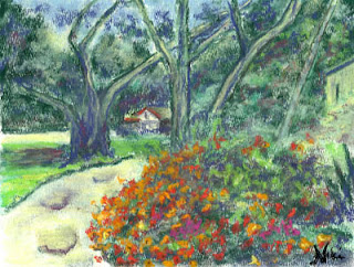
Well, in honor of being almost to my 200th post on this blog, I thought I'd do a series: 10 Reasons to Love Pastels. Since I spend most of my time scrubbing chalk into my paintings, I'll be focusing on chalk pastels for these posts, and how I've learned to love so many things about them over the last (gulp) nine years of painting with soft pastel. Reason #10 to love soft pastels: they can be blended with water! "Down at the Oaks" 9 x 12 Chalk pastel on watercolor paper Click here to view large or purchase Chalk pastels are easy to blend with water, by taking a dry pastel painting (on watercolor paper or canvas) and brushing with water.  Click here to see a detailed tutorial on using this method. You can also paint with wet pastel sticks directly on canvas, or press dry pastel sticks onto a wet paper or canvas to get a unique effect: "The Road to Reno" 9 x 12 Chalk pastel on flat canvas Click here to view large or purchase There are d...

Dark to Light (How to make your pastels stand out)

Image
In my first pastel class, I remember learning a basic method of blocking in darks and lights when we started a painting.  Later, the teacher mentioned that pastels are meant to be painted with lights on top of darks. I always seemed to run through my light-colored pastels about twice as quickly as I used my darks, mostly because I felt like I lost my lights as I worked. What I eventually learned was how important those darks were in establishing contrast.   "Jardin" 9 x 12 Chalk pastel on flat canvas Click here to view large or purchase In the painting above, using pastels dipped in water gave them a darker finish, which helped highlight those lighter areas of the piece.  In the following painting, you can see how I got a little too excited about the color and had to work on the darks and lights to rein it back in: Stage 1: Woo hoo!  Color!  Umm, where are the darks?  Stage 2: More darks added  Stage 3: Adding lights on top of d...

An "Omenous" Morning

Image
"Down the Hill" 9 x 12 Chalk pastel on flat canvas Click here to view large or purchase    I'm not a superstitious person, although I was as a child.  In fact, I probably would have been considered an obsessive-compulsive, as I believed that if I wore certain things, or lined my dolls up a certain way, good or bad things might happen.  Thankfully, I've grown out of that stuff. We live in a rural area, although we are close to civilization.  This means that once the freeway sounds die down at night, we get to hear an abundance of owls.  My mom once informed me that hearing an owl means that someone is going to die.  I explained to her that we hear them every night, and we were still here.  If anything, the owls were a blessing because they helped keep the mouse population down, and less mice hopefully means less rattlesnakes.  This is typically my reaction to such beliefs. I'm not above the occasional attack of foreboding, ...

Simplifying...It's Complicated.

Image
                                     "Ridgeline" 9 x 12 Chalk and Oil Pastel on Flat Canvas Click here to purchase original I may have mentioned before that I had a teacher who would ask if we were "simplifiers" or complicators" as painters.  I wanted to say I was a complicator, because I get caught up in noodling and making sure things look exactly the way I want before I consider a piece finished.  In my heart, though, I think I am a simplifier-- a quick look at most of my artwork would show that I like to focus on the big shapes, values, and colors. I started"Ridgeline" plein air with chalk pastel on canvas.  It came out a bit dull though, so I added water to blend it.  The water didn't do much, so I began working in some oil pastel to bring out those brighter colors.  ...

The Importance of Playing With Color

Image
"Seabird" 8 x 10 Chalk Pastel on Flat Canvas Click here to purchase original In your average harbor, the water isn't the cleanest-looking. Neither are the birds. When the sun hits everything just right, rich colors still come through...and then there's always my favorite option: exaggerate. The seagull above wasn't the most colorful bird, and the rocks and water were also a bit dull at first glance. Adding teal and orange as the basic color scheme livened it up a little, and still kept the harbor tones in the painting. I know you won't find much orange (and definitely not any teal) on a seagull, but it makes for a more interesting painting to take a few artistic liberties with color to please the eye. For the next piece, I wanted the emphasis to be on color and natural elements. The reference photo I used was taken from an airboat in Florida, and featured gray sky, almost gray water, and straw colored grass with a hint of green. Those colors are power...