Posts

Showing posts from 2013

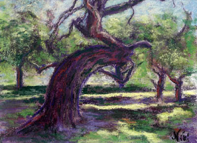
Number 4 of 10 Reasons to Love Pastel: Push-Pull

Image
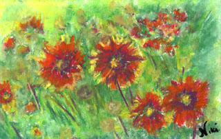
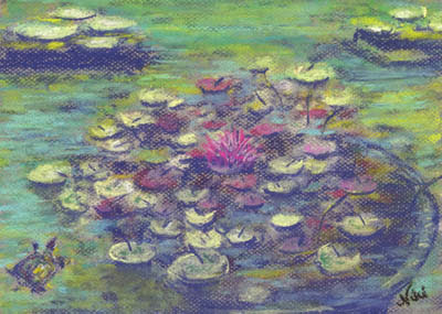
"Hippie Flowers" 6 x 9 inch pastel on drawing paper Click here to view large or see purchase details December usually isn't the best time for me-- everything seems to hit the fan mid-month, leaving me exhausted (and this time sick) by the time the holidays are over.  These little flowers cheered me up as I worked on them (I called them "Hippie Flowers" because they reminded me of something from the sixties). In spite of that, I've been working for a while on a few pieces to demonstrate one of my favorite elements of painting with pastel: the delicate push-pull between the soft, blended areas and the bolder, harder lines and strokes. One of the most relaxing things I can think of to do is to smear a pastel painting. In my first pastel classes, we learned to block in areas of color and smear the painting as a whole to achieve that soft background effect unique to pastel.  After a layer of fixative (if desired), we would then go back over the piece, a

10 Reasons to Love Pastel: Soft Impressions

Image
I believe I've made it to number five of my 10 reasons to love pastel: it's a natural choice for impressionists! "Balboa Turtle" 9 x 12 Pastel on Paper Click here to view large or see purchase details  If you're a fan of the Impressionist Movement, chances are you've enjoyed a few pieces created with pastel.  Pastel lends itself naturally to the quick strokes and dappled lights and darks of the impressionist style, and it's relatively easy to use in a plein air (outside) or alla prima (all in one session) painting setting.  The soft, smeary nature of dry pastel also makes it an ideal medium for paintings that focus on overall lights and darks without a lot of hard line and detail.  "Balboa Water Lilies" 9 x 12 Pastel on Paper Click here to view large or see purchase details   I was lucky enough to visit Musee D'Orsay  as a teenager (thanks to my generous host parents when I was an exchange student), and I couldn't w

10 Reasons to Love Pastel: Lights and Shadows

Image
"Bitter Harvest" 6 x 9 inch Pastel on Paper Click here to view large or see purchase details One of the things I tend to mess up when using pastel is that I often lose my lights.  When I remember to be careful and maintain contrast, the outcome is usually much better. It took me a few years of working with pastel to realize that soft pastels layer in better dark to light.  I now know that it's important to save those lights for the end, and make sure they have plenty of room in my paintings.  Adding lights too early contributes to "mud," when colors blend together in a way that makes them look dull.  I still use up my lighter colored pastels much quicker than my dark ones-- a little dark pastel goes a long way, whereas the lighter colors need a few layers to really stand out.  Using a toothy pastel paper gives the light pastel something to grip, making it stand out even more. "Bitter Harvest II" 6 x 9 inch pastel on paper Click here to view

10 Reasons to Love Pastel: Texture!

Image
Reason #7 to love pastel: You can get great texture effects with it! "Fishin', Hopin', Prayin" 8 x 12 inch Mixed Media on Paper Click here to view large or see purchase details I always enjoy using a palette knife to create heavily textured paintings, but I enjoy the process even more when I finish the piece with a couple of layers of pastel (oil or soft pastel work great, but they each have different effects). Click here to view a tutorial on Empty Easel featuring the technique I used for this piece! For the piece above, I started with some photos I had taken on a cold afternoon at a crowded beach.  I wanted to capture the cold feeling of the day, so I used cool tones to create the water, painting in the strokes with a palette knife.  Once the acrylic dries, it's ready for the pastel, which can be scraped lightly over heavily textured parts or layered in as you would normally use pastel for the smoother areas of the piece.  Combining acrylic with p

10 Reasons to Love Pastel: Color!

Image
"Beach Stroll" 9 x 12 Pastel on Paper Click here to view details It's a little easy to get drunk on color when using pastels.  When I first took pastel classes, it was difficult for me to stick to values when beginning a painting-- I always jumped into the bright colors (and quickly ended up in trouble).  Even now, if I'm having difficulty getting into painting mode, I can just open a box of brightly colored pastels and feel instantly inspired.  "Mermaid" 9 x 12 Pastel on Paper Click here to view details   Pastels come in a wide array of bright colors, and you don't have to do any mixing (although you can blend the colors if you wish).  Pastels hold their strong colors without fading for a long time, and there's no need to worry about cracking or drying out over time as there is with oil or acrylic. For me, the color sets the mood for a painting.  I know I can always use my trusty pastels to convey whatever mood I'm expressing w

10 Reasons to Love Pastel: It Looks Great Over Watercolor!

Image
  "Abstract Flower" (View 1) 6 x 9 in. Pastel on Watercolor-Toned Paper Click here to see large or additional views     In the previous post, my number 10 reason for loving pastels was that they can be blended with water (chalk pastels in this case).    Now for number nine: You can use it over watercolor!   Another great technique for working with pastel is to tone some paper with watercolor, and create a dry pastel painting on the toned paper.  I did this in the piece above, using green watercolor on paper before working in the red, purple, and yellow-green tones with pastel.      Some tips for using watercolor as a surface primer for a pastel painting:   Vary the tones and values of the watercolor, so it creates an interesting background for your pastel.   Make sure the watercolor has plenty of time to dry completely before you start working with the pastel--otherwise you run the risk of ripping your paper.   Higher quality paper wil

10 Reasons to Love Pastels: Just Add Water

Image
Well, in honor of being almost to my 200th post on this blog, I thought I'd do a series: 10 Reasons to Love Pastels. Since I spend most of my time scrubbing chalk into my paintings, I'll be focusing on chalk pastels for these posts, and how I've learned to love so many things about them over the last (gulp) nine years of painting with soft pastel. Reason #10 to love soft pastels: they can be blended with water! "Down at the Oaks" 9 x 12 Chalk pastel on watercolor paper Click here to view large or purchase Chalk pastels are easy to blend with water, by taking a dry pastel painting (on watercolor paper or canvas) and brushing with water.  Click here to see a detailed tutorial on using this method. You can also paint with wet pastel sticks directly on canvas, or press dry pastel sticks onto a wet paper or canvas to get a unique effect: "The Road to Reno" 9 x 12 Chalk pastel on flat canvas Click here to view large or purchase There are d

Remember Narnia?

Image
"Bowing Oak" 9 x 12 inch Chalk pastel on flat canvas Click here to view large or purchase There are many sights that inspire artists here in Fallbrook.  Live Oak Park is both a wonderful location for families and a great place to take in the play of light and shadow on the trees. As a child, I remember enjoying the twists and turns of the park and the large, shady areas to run wild with other kids.  As an adult who likes to paint trees, I have a whole new appreciation for the park.  The tree in the painting above inspired me both from an artist's and a child's point of view.  It reminded me of the dryads in one of my favorite childhood book series, The Chronicles of Narnia .  Although I enjoy the Narnia movies, my memories of the books are much stronger, and one of the scenes I often think of when I see such lifelike trees is when Susan and Lucy happened upon the Dryads dancing in the moonlight. "Bowing Oak" was created with my favorite technique f

Road Trip!

Image
"Sierra Slopes" 8 x 10 inch Chalk and Oil Pastel on Flat Canvas Click here to view prints I learned a few things on a recent trip up highway 395. Babies can only handle so much time in a carseat (especially on the way home.  It's like they know ). My phone can take focused pictures through glass at high rates of speed (not above the speed limit, of course).  There might be some reflections on the photo, but I can edit those out as needed. A long car trip is much more tolerable if you look at the scenery as potential paintings. Not all McDonald's bathrooms are created equal. Once I got home, I flipped through my photo gallery on my phone and was pretty excited about what I had.  As I worked on this painting, I did a little thinking about the benefits of using flat canvas for pastels: Less prep work: no paper, board, tape required! Nice toothy, textured surface (not great if you like that velvety smooth look, though) Lightweight, easy to handle A

Inspiration Photos and Making Friends with Fixative

Image
"Old Temecula Field" 12 x 16 in Pastel on flat canvas (oil/chalk) Click here to view large or purchase I started with a photo from my phone (it takes pretty amazing pictures if the light's right).  I took the photo behind Pat and Oscar's restaurant in Temecula, because between the clouds, the light, and the open field, I felt like I was catching a glimpse of my childhood.  We moved to the area in the late '80's, back before it had any stoplights (or malls, or SUV's).  I remember the thrill of being allowed to walk home with my friends who lived close to school, tromping through empty fields to get to their houses. As you can see, I can't really call this a reference photo, as it's quite different from the painting.  It was definitely an inspiration though, and I did refer back to it for some of the values and composition.  I actually started the piece with a layer of blue acrylic before adding in an oil pastel underpainting.  I then work

Every Single Ripple (painting reflective water)

Image
"Venetian Duck" 12 x 16 Chalk pastel on flat canvas Click here to view large or purchase Water is one of my favorite subjects to paint.  It's also one of the most difficult subjects to paint (for me, anyway).  I took the photo for the above painting in Venice, California.  We took a walk along the canals and happened upon a duck (apparently the locals nicknamed her "Daisy.")  I took the photo because of the reflections in the water, knowing I would like to try to turn it into a painting. I tried it out on textured paper with dry pastel, but I kept losing my darks.  It came out much better on the second try, when I pressed wet chalk pastels directly onto flat canvas to get those nice dark shapes.  It took many layers of wet chalk, fixative, and dry chalk to get the final result. It you're going to paint water, it helps to remember a few things: *Water is always horizontally straight to the eye.  That means any horizontal lines you make in your wat

The Frog in Boiling Water

Image
"Avocado Lights" 24 x 30 in Acrylic on Gallery Wrap Canvas ORIGINAL SOLD Click here to view print choices It's Avocado time again...April is the month of the Avocado Festival and Art of the Avocado show in Fallbrook.  The piece above is my entry in the Art of the Avocado, on display at Brandon Gallery in Fallbrook, California through April 27th. What do frogs have to do with avocados?  Nothing, except that if I hadn't realized I'd turned into one, I wouldn't have finished my piece for the Art of the Avocado show.  I've heard of the phrase "frog in boiling water," meaning that if you cook(?) a frog in boiling water that starts out cold, the frog doesn't realize what's happening until it's too late, since the water heats slowly, gradually increasing in temperature. I spent a couple of months feeling gradually more and more fatigued, until I got so tired I could barely stand to get through the day.  I thought it was a post-b

Dark to Light (How to make your pastels stand out)

Image
In my first pastel class, I remember learning a basic method of blocking in darks and lights when we started a painting.  Later, the teacher mentioned that pastels are meant to be painted with lights on top of darks. I always seemed to run through my light-colored pastels about twice as quickly as I used my darks, mostly because I felt like I lost my lights as I worked. What I eventually learned was how important those darks were in establishing contrast.   "Jardin" 9 x 12 Chalk pastel on flat canvas Click here to view large or purchase In the painting above, using pastels dipped in water gave them a darker finish, which helped highlight those lighter areas of the piece.  In the following painting, you can see how I got a little too excited about the color and had to work on the darks and lights to rein it back in: Stage 1: Woo hoo!  Color!  Umm, where are the darks?  Stage 2: More darks added  Stage 3: Adding lights on top of darks make

Birdwalking....with Collage

Image
What is "birdwalking?"  My understanding of the word is that it means to stray off topic.  As you can imagine, creative people are often drawn to all types of activities and forms of expression.  This is not great for marketing, I suppose, but as one of my favorite former art teachers would say, "So What?" I did a couple of collage pieces back when I was recovering from a few months of morning sickness, and knew I had found a fun way to create art that appealed to my sometimes child-inspired view of life.  After having another baby, there's been precious little time to do much of anything artistic, and for a while I was struggling with the frustration of never being able to really focus on my paintings for more than a few minutes at a time. With these pieces, I could pick them up and put them down as time allowed, and even do a little work with a baby in the wrap and a preschooler yapping in my ear.  The following three were inspired by the children's so

An "Omenous" Morning

Image
"Down the Hill" 9 x 12 Chalk pastel on flat canvas Click here to view large or purchase    I'm not a superstitious person, although I was as a child.  In fact, I probably would have been considered an obsessive-compulsive, as I believed that if I wore certain things, or lined my dolls up a certain way, good or bad things might happen.  Thankfully, I've grown out of that stuff. We live in a rural area, although we are close to civilization.  This means that once the freeway sounds die down at night, we get to hear an abundance of owls.  My mom once informed me that hearing an owl means that someone is going to die.  I explained to her that we hear them every night, and we were still here.  If anything, the owls were a blessing because they helped keep the mouse population down, and less mice hopefully means less rattlesnakes.  This is typically my reaction to such beliefs. I'm not above the occasional attack of foreboding, though.  Our usual favorite mark

Time to Play!

Image
"Afternoon in the Park" 9 x 12 Chalk pastel on flat canvas Click here to view large/purchase   I'm looking for new homes for some daily paintings, so I can make room for new ones!  Stop in and view my ebay listings.   I've been reading a lot of blog posts on marketing, and there seems to be a constant tension for artists between staying within a defined style and experimenting.  I agree that it's important to find your own voice as an artist, and that your collectors will appreciate  your recognizable style.  That said, the thing I enjoy most about painting is trying new things, so it's hard for me to personally stick with one style, technique, or subject matter for too long. The painting above was created in a day, and was an experiment with chalk pastels and water on flat canvas.  If I'm going to mix chalk and water, I usually block in my drawings with pastel first and then begin working in the water to blend the lights and darks.  I wa

It's Definitely Work.

Image
"Oorah!" 9 x 12 Chalk pastel on flat canvas Click here to view large or purchase I got a little carried away with this one, and it's on fairly small canvas-- a painting of a boat that we used to walk by quite often at the harbor in Oceanside, California.   Oceanside Harbor is right next to Camp Pendleton.   If you live anywhere near a military base that houses marines, you know what "Oorah!" means. I began the piece with a blue chalk sketch on a piece of flat canvas, and blended the chalk with water to give it a bit of a watercolor feel.  Water helps stick the chalk to the canvas, eliminating some of that annoying dust and also replacing the potent can of fixative I sometimes break out in case of emergency.  It's best to use a watercolor brush and have a paper towel handy if you want to lift out some extra highlights, and keep the canvas absolutely flat as it dries. I meant to go for a more secondary color scheme with greens, purples, and a bit of o