10 Reasons to Love Pastel: Lights and Shadows
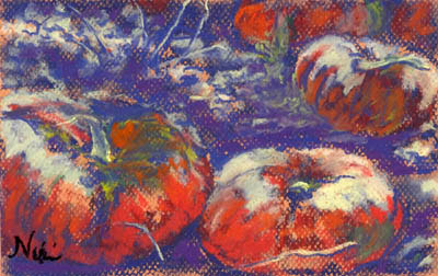
"Bitter Harvest" 6 x 9 inch Pastel on Paper Click here to view large or see purchase details One of the things I tend to mess up when using pastel is that I often lose my lights. When I remember to be careful and maintain contrast, the outcome is usually much better. It took me a few years of working with pastel to realize that soft pastels layer in better dark to light. I now know that it's important to save those lights for the end, and make sure they have plenty of room in my paintings. Adding lights too early contributes to "mud," when colors blend together in a way that makes them look dull. I still use up my lighter colored pastels much quicker than my dark ones-- a little dark pastel goes a long way, whereas the lighter colors need a few layers to really stand out. Using a toothy pastel paper gives the light pastel something to grip, making it stand out even more. "Bitter Harvest II" 6 x 9 inch pastel on paper Click here to...