Posts

Showing posts from 2011

Playing with Texture (Mixed Media Madness)

Image
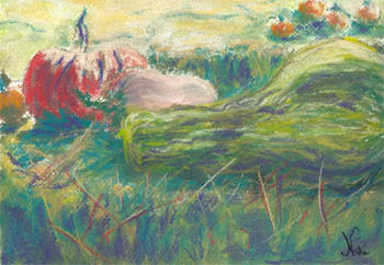
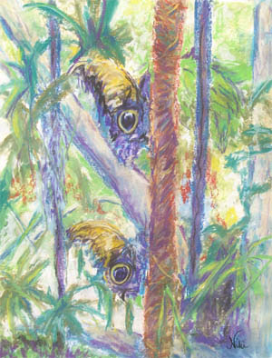
These paintings have taken a while to complete. They were done in multiple layers, over sporadic sessions. The first one began with an acrylic knife painting on Canson Canva-paper, and was inspired by a photo of the plants at a butterfly exhibit near San Diego, CA: "Indoor Garden" 12 x 16 Mixed Media on Paper Click here to purchase original I finished the painting by adding layers of chalk pastel and a bit more acrylic. It was so heavily textured, I had to knock some of the pastel back to soften the center of the piece. I wanted to show how alive the plants were: flowers swaying from the ceiling, blossoms bursting out of pots and bushes, and leaves sprouting all over the background. The large black pot and green beams help anchor all the plant life, reminding the viewers that they are experiencing an indoor garden, rather than a lush jungle. In contrast to all this vibrant growth, the next piece was inspired by the comforting forms of a pair of pitchers: "Big

A Long, Cold Day

Image
"Maurice Car'rie Barn" 9 x 12 Chalk Pastel on Paper Original sold Click here to view print choices It was not the best day to set up a tent outside a winery to sell paintings. The cold was bearable at first, until the wind kicked up. My booth held steady in the wind (my tables, not so much). There were some great views from my spot, though, so I decided to make the most of it and work on some pastel paintings. Painting plein air has become quite comforting to me now. I've learned to tune out most distractions and concentrate on what it is I'm painting, which is a difficult thing to do at first. I'm even learning to appreciate the conversations that happen as a result of painting in front of strangers. I had a particularly funny conversation with a young child (they always find me-- teacher radar I suppose) about painting. He wanted to know if I was trying to copy something, and I said no, if I want to copy things I take photos. He wanted to know how

Canson Canva-Paper: Great for Mixed Media!

Image
I hit a wall a few weeks ago, after taking a week off painting. I returned to pastels and plein air, only to feel that I needed to breathe new life into my work. The best way I know to do that: experiment! I've used Canson Canva-paper a few times before. I wanted to see how it held up under some thick paint, and played around with my palette knife and some acrylic paint (applied impasto style). After adding a layer of chalk pastel to each, I ended up with the following two pieces: "Shimmer" 12 x 16 Acrylic and Pastel on Canson Canva-paper Click here to purchase original "Dschungel" 12 x 16 Acrylic and Chalk Pastel on Canson Canva-paper Email nicolehilsabeck@yahoo.com if interested in purchasing ("Dschungel" is German for "Jungle." It's always been one of my favorite German words.) Both of these pieces were based loosely on photographs taken around Southern California (one at a butterfly exhibit, another at a theme park). I

A New Medium (Watercolor and Pencil)

Image
"Chatte et Pomegranates" 5 x 6 Watercolor and Colored Pencil on Card We've been getting some dry, cold weather in between brief storms. Between having dry hands and finding it a little cold outside to work with pastels, I thought I might try a little different direction and play with watercolor. The subject for the painting above is a cat who has been in the family for many years. A few years back, we had quite a pomegranate crop, and I brought a basket of them over to my sister's. The cat sniffed them curiously, then sat down by them in disgust. She looked so funny sitting guard by the basket, I had to take a picture. I thought it might make a nice card for this time of year, and set out to paint it on one of my Strathmore watercolor cards. After getting the basic watercolor painting done, I tried out my spectracolor pencils as a finishing touch. I've never really used these seriously before, but Ive often wondered how they would look over paint. They ble

Stormy Inspiration

Image
"Storm Headed East" 9 x 12 Chalk Pastel on Paper Email nicolehilsabeck@yahoo.com if interested in purchasing This one wasn't technically plein air, although I did paint it in action! It was a stormy day, so I worked in front of the kitchen window as the clouds barrelled eastward. This painting was unique in that I was able to begin and finish it in one session while my daughter was awake-- never been able to pull that off before! Whenever we get a good rain in Fallbrook, the colors of the surrounding hills become richer: purples get darker, greens are more vivid, and bits of sanguine red peek through the bushes and trees. Set against the backdrop of a gunmetal sky, the colors become even more striking. I always stop to appreciate the view of a rainy day (once the fog clears), and this was the first time I tried to capture its beauty on paper. The day before, it was quite windy, so I did my plein air work close to the ground: "Plein Air Shrooms" 9 x

Cactus: Ridiculous or...ridiculous?

Image
"Plein Air Cactus" 9 x 12 Chalk Pastel on Paper Click here to view print choices: http://www.redbubble.com/people/nikihilsabeck/art/7997949-plein-air-cactus-pastel The cactus plant: a common sight in Southern California, it means different things to different people. For some, it's ugly (I have a friend who hates succulents in general). For baby squirrels, it's a safe home. For random strangers at the end of my street, it's apparently dinner. You think I'm joking? There's often quite a crowd out there with their plastic bags and knives, helping themselves. For me, it's something that's always available to paint, but I only do so after careful deliberation-- painting cactus is like working on a puzzle. In this case, it was the play of light and shadow on the plant that inspired me to work. I really had to get into right brain mode, though, because my left brain was screaming "It looks like a hand! A hand with fat wide finger

Harvest Time

Image
"Harvest Time" 9 x 12 Chalk Pastel on Paper Click here to purchase Back from a hiatus, and in the fall mood... I used good old Arches watercolor paper for this piece, and blended my chalks using water. The color scheme was supposed to be red, gold, and green based colors, but I had to add a bit of purple for emphasis. It's a scene from our trip last year to Lavender Hill Pumpkin Patch in Fallbrook. I always spend a little too much time hovering around the different types of pumpkinsand gourds, snapping as many photos as I can for later paintings. I guess you could say that I share my toddler's excitement when it comes to the sight of pumpkins. This was the first piece I painted in the last couple of weeks that I felt like sharing. I'd intended to paint through a trip up north and continue painting on return; unfortunately, it took me a while to jump back into my routine. Taking a break gave me a chance to get a fresh perspective on my art, and now I'm

A View of Dusk

Image
"Dusk in the Grove" 9 x 12 Chalk Pastel on Paper Click here to purchase original It's hard to tell which is a more inspiring time to paint: dusk or dawn. Not being much of a morning person, most of my paintings take their inspiration from dusk. In "Dusk in the Grove," I used a picture taken on my phone as reference (had to set the screen time out to 10 minutes so I wouldn't go crazy). We were visiting friends in Fallbrook, and my daughter had grown squirmy. This led to an outdoor walk, and we followed a sulky black cat through the trees. I was actually trying to get a photo of the cat for my daughter, but it had managed to disappear. I like pictures of shaggy, unmanicured grove trees better than the well-maintained kind, so I snapped one for future reference. This painting shows what I love most about living in Fallbrook: each piece of property has its own agricultural charms, and as the light fades to the west, there is a sense of peace and anticipa

Out in the Cold

Image
"Sleeping Under the Clouds" 9 x 12 Pastel on Paper Click here to view large or purchase: http://www.nikihilsabeck.com/art/sleeping-under-the-clouds/ It was another lucky moment: the little one was asleep in the car, the rain had stopped, and things were just dry enough for me to grab my materials and sit outside and paint some of the striking clouds passing through Fallbrook. I sketched the land portion first, then turned my attention to the sky. I worked quickly, my fingers cramping a bit in the cold. Thanks to the steady wind, the clouds sped along, changing lights and darks but remaining purple and blue. Once I had them fairly well blocked in, I went back to the land, a part of Fallbrook known as the "Sleeping Indian" (supposed to resemble one sleeping on his back, presumably). I always looked for this landmark as a child, since it often meant we were getting close to my grandmother's house in Fallbrook. I honestly don't know how people work wit

Autumn Colors in California

Image
"Pumpkin Pair" 4.5 x 6 in. Chalk Pastel on Paper Click here to purchase I found this little pair at the pumpkin patch in Fallbrook last year. They looked so cozy together, I had to take a quick picture. Fall is a great time to be outside in Southern California. Most of the time the weather is clear and warm without the stickiness of summer. The intense light makes for great photographs and paintings, as it casts extra dark shadows and highlights all the bright colors of our beautiful surroundings. The air is also cleaner now than it is in the summertime, which means sharper visibility of all the surrounding hills and mountains. I was relieved that my daughter passed these two pumpkins by last year. I would have felt bad if she decided to separate them and take one home. A little fun I had with watercolor and pastel last year: "A Fauve Goes to the Pumpkin Patch" Click here to see additional originals for sale: http://www.nikihilsabeck.com/

A Darker Mood

Image
"Cling" 9 x 12 Chalk Pastel on Paper Click here to view prints: http://www.redbubble.com/people/nikihilsabeck/art/7832237-cling-pastel Here is another butterfly pastel, on Canson Mi-Teintes paper and with a little darker feel to it than the last one. I normally paint in a bright and sunny fashion, as I happen to agree with Renoir's famous stance on ugliness in art: there's enough ugliness in the world, so why not paint beauty instead? Ocassionally, however, a less cheerful mood will overtake some of my work. In this case, the colors came out fairly dark, and the butterfly took on the appearance of clinging to the foliage rather than hanging delicately as it was in my reference photo. The surrounding plants appear to part ways, as though a wind is sweeping through the area and leaving the butterfly to hang on desperately until it passes. There is light in the background, suggesting that the dark wind will pass and the warm light will take over. The di

Beauty in Hiding (How to use chalk pastels and water)

Image
"Beauty in Hiding" 18 x 24 Chalk Pastel on Paper Original Sold When most people think of chalk pastel, they don't think of brushes and water. Chalk pastel is in fact quite water soluble, if you know work carefully and adjust for the dust. The piece above was based on a reference photo of butterflies at a seasonal exhibit. These particular butterflies have unique camouflage, with large shapes on the wings resembling (to me at least) owl eyes. The trick for this piece was to showcase the butterflies in all their camouflage glory without losing them in the background. I also wanted to work large. Using Canson watercolor paper, I utilized the following steps to achieve the end result (the work in progress photos are unfortunately darker because I took them at night): Stage one: using chalk pastels, I drew in my composition and blocked in lights and darks on taped down watercolor paper (this exercise does not work on paper made for dry pastels! Flat canvas works

The Joys of Painting At Home

Image
"Along the Canal" 20 x 20 Acrylic on Box Canvas (Original donated to S.A.F.E. Temecula for auction) A couple of totally different painting experiences, both at home: one so relaxing I could barely keep my eyes open, the other so frustrating I had to take frequent time-outs. I firmly believe that it is to my benefit as an artist to be able to drop everything and work on a painting or drawing, no matter where I am. Gone are the days where the combination of timing, inspiration, and availability of materials all had to come together in order for me to spend some time making art. I now know that waiting for those moments to come would mean never getting any work done at all, so I took a strategy from my writing days instead: be prepared to paint at any free moment, and put some time in each day. Painting at home should give me plenty of opportunity for this, right? Well, there's definitely opportunity...it just takes a cool head and a persistent hand to make the most

The Importance of Playing With Color

Image
"Seabird" 8 x 10 Chalk Pastel on Flat Canvas Click here to purchase original In your average harbor, the water isn't the cleanest-looking. Neither are the birds. When the sun hits everything just right, rich colors still come through...and then there's always my favorite option: exaggerate. The seagull above wasn't the most colorful bird, and the rocks and water were also a bit dull at first glance. Adding teal and orange as the basic color scheme livened it up a little, and still kept the harbor tones in the painting. I know you won't find much orange (and definitely not any teal) on a seagull, but it makes for a more interesting painting to take a few artistic liberties with color to please the eye. For the next piece, I wanted the emphasis to be on color and natural elements. The reference photo I used was taken from an airboat in Florida, and featured gray sky, almost gray water, and straw colored grass with a hint of green. Those colors are power

This is San Diego?

Image
"San Diego Backcountry" 9 x 12 in. chalk pastel on paper Well, it's not in the city of San Diego... It's another one of those views from the tram at the Safari Park, which is in San Diego County. Once you leave the coast, much of San Diego county looks like the above painting. It's been unbearably hot these last few days. Sometimes the heat inspires me to paint cooler places like the beach; according to the weather channel website, it's even hotter down at the coast than it is here today. For this painting, I worked quickly, having already formed the idea based on a reference photo ahead of time. The simple composition and emphasis on color (especially the orange paper) were the main components. California is famous for supposedly not having seasons. Anyone who spends a fair amount of time here can tell that summer is slipping into fall by looking at the sky: the blue deepens into a bold azure,providing a stunning backdrop for the golden hills as

An Idyllic Combination (pastels on canvas)

Image
"Hideaway" 8 x 10 Pastel (Oil and Chalk) on Canvas Click here to purchase It started out as a sketch on brown paper, using charcoal and ink, inspired by the gazebo outside Glen Ivy Hot Springs in California. Thinking (as usual) that it would look so much better in color, it became a pastel painting on canvas. I bought a bunch of little flat canvasses at a cheap price a while back, thinking they would be good for practice or plein aire. Using my previous charcoal and ink sketch as a guide, I blocked in the trees and gazebo with ultramarine blue chalk pastel on the canvas. I then used a wet brush to blend the blue chalk, identifying lights and darks and middle values. It sat in this stage for a while, as I wasn't sure whether to add more chalk, use the underpainting as a base for some acrylic, or to try out the oil and chalk combination. I knew I wanted the end result to have a warm, tropical mood, complete with a turquoise sky, lots of green, and a splash of red

Here's to Surfers! (Most of them, anyway...)

Image
"Happy Hour" 5.5 x 7in. chalk pastel on paper Click here to buy original or view large Cards starting at $2.40 (click here): http://www.redbubble.com/people/nikihilsabeck/art/7619119-happy-hour-pastel Used the back side of some Canson Mi-Teintes to get that bright effect this time (I would only recommend this for quick pieces that don't have a lot of layering...) Oceanside Harbor has become quite popular with surfers lately. Years ago, I didn't quite understand why the beach was separated into designated surf and swim areas, as there were only a few surfers out there on most occasions. Between the summer season and the increase in popularity of surfing, there is now a definite need for all those flags and signs, as it's much more crowded out there in the water. I usually take photos of the whole beach, and focus in on interesting figures later when looking for inspiration. I remember this particular surfer, who showed up during the afternoon rush (kind of

Dangerous Waters: The Temptation To Overwork A Painting

Image
"Breaking the Day" 17 x 23 in. Mixed Media on Paper Another workshop, this time working from digital art-- in this case it was Randy Sprout's "Fortuna on the Spot" (Click here to view Randy Sprout's original piece: http://www.redbubble.com/people/randysprout/art/4863131-fortuna-on-the-spot ) To participate in Sojie 13, I chose to approach Randy about his piece for two reasons: I loved the bold composition of the digital work, and I have a strange need to paint boats on a regular basis. I thought I would approach the piece as an acrylic painting with chalk pastel as a top layer. It turned out to be more of a pastel painting on an acrylic surface, because I ended up covering the entire acrylic painting with the chalk. It started off simple enough, and I liked my original sketch so much I had to convince myself to get started with the paint. It's not that I have such a high opinion of my sketching abilities, but rather that I

Familiar Roads

Image
"The Road to Fallbrook" 4.5 x 6 in chalk pastel on paper Click here to view large or purchase Another plein aire view from home, this time the familiar view of Mission Road into Fallbrook... This painting was initially done a couple weeks ago, but the hills didn't look quite right, so I went back to it later to reshape them a bit. Sometimes the most familiar scenes are the most difficult to paint, as we know them so well it's hard to let go of the differences between the actual view and the painting. This road is a pretty quiet one, unless you're on it in the commuting hours on a weekday. Morning traffic piles up as cars form a line to cut through Fallbrook to get to the military base in Oceanside. The same crowd returns in the early evening to head back home. Rather than include the cars, I left the road empty to show how it looks on a weekend morning, when the "Friendly Village" gets a break from all of the base traffic. I've always like

Familiar Roads

Image
"The Road to Fallbrook" 4.5 x 6 in chalk pastel on paper $30 Click here to view large or purchase Another plein aire view from home, this time the familiar view of Mission Road into Fallbrook... This painting was initially done a couple weeks ago, but the hills didn't look quite right, so I went back to it later to reshape them a bit. Sometimes the most familiar scenes are the most difficult to paint, as we know them so well it's hard to let go of the differences between the actual view and the painting. This road is a pretty quiet one, unless you're on it in the commuting hours on a weekday. Morning traffic piles up as cars form a line to cut through Fallbrook to get to the military base in Oceanside. The same crowd returns in the early evening to head back home. Rather than include the cars, I left the road empty to show how it looks on a weekend morning, when the "Friendly Village" gets a break from all of the base traffic. I've always l