Posts

Showing posts from March, 2011

Avocado on the Side

Image
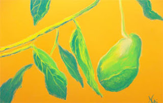
"Avocado on the Side" 12 x 18 chalk pastel on paper Click here to buy print: http://www.redbubble.com/people/nikihilsabeck/art/6955621-1-avocado-on-the-side-pastel Getting ready for the Avocado Festival... This year, I decided to enter the "Art of the Avocado" contest, sponsored by the Fallbrook Chamber of Commerce. I've been putting together a lot of avocado-themed pieces, but I couldn't decide on one for the show. Finally, I created this one: a simple chalk pastel on Canson Mi-Teintes paper. It was different from all of the previous pieces in that I didn't include all of the details I had in my other avocado works. It's also much brighter. During one of my art classes at UCR, the instructor asked us if we were "simplifiers" or "complicators." I still don't know the answer to that. I have a feeling that my tendency is to complicate, but once I realize that I'm losing control, I reign it in and bring the piece back to ba

Tropical Layers

Image
Tropicale 12 x 18 Chalk pastel on paper Click here to purchase  There are times when I find myself hating a piece until the very end, when it all finally starts to make sense. This usually happens when I try something a little different, and am not sure if the risk is going to pay off artistically or not. "Tropicale" was one of those pieces. Once it was complete, I was quite happy with the experiment. I used dark green Canson Mi-Teintes paper, thinking the green would blend nicely with the background. I thought I would try to exercise some patience and build the trees with layers of color. It quickly turned into a battle between the colors, and I was fighting to keep the trees from turning into mud. I finally realized that no matter how many layers of lights I added to the foliage, it wouldn't look right until I went back in with some darks. I used my almost black gray pastel, and worked in some tiny shadows to emphasize the lights. Once I was finished, I put the

Still Life with a Bird

Image
"Vogel-Figured" 12 x 12 Pastel on Paper Click here to buy print: http://www.redbubble.com/people/nikihilsabeck/art/6941167-1-vogel-figured-pastel What to do when I have a rare bit of quiet in the morning and don't know what to paint? Still life! I have way too many little knick-knacks around the house, which I keep available because I intend to paint them some day. This is one of two little bird figurines given to me last year. The second one is sitting in my broken pile, waiting for glue. Between a house full of cats, a toddler, and my own personal set of butterfingers, most of these figures end up broken. I've always liked the shape of these birds, and thought it would be good practice for me to paint the still intact bird as a daily painting. One of the most memorable painting tips I've read was from my Chinese brushpainting book: when painting a bird, keep to the form of an egg. This little bird is particularly-egg shaped, making it easy to follow that piece

Keep Off the Rocks!

Image
"Keep Off the Rocks" 9 x 12 chalk pastel on paper (framed) Click here to purchase Last summer, we spent a day at the beach at Aliso Creek. I don't normally go to Orange County beaches, being partial to San Diego. I did get some great photos of the rocks and cliff at this beach, though, one of which inspired this painting. This group of rocks looks particularly inviting, with lots of flat areas. It has a large sign warning people to stay off of the rocks, probably because they are constantly bombarded with waves and most likely slippery (see the green in the upper half of the painting). Throughout the day, the lifeguards repeatedly had to trot out to the rocks and tell people to go back to the sand. Finally toward the end of the day, they drove over to the area and made a loud announcement on the speaker, reminding people to stay off the rocks not only for the rest of the day, but the rest of the summer. It was pretty funny. It's been dark and rainy off and on

Venice Canals (in an impressionist style)

Image
"Canal" 9 x 12 chalk pastel on grey toned Mi-Teintes paper Click here to buy print: http://www.redbubble.com/people/nikihilsabeck/art/6901630-1-canal-pastel I tried to keep this one light and loose-- it was on small paper. I've painted this subject before, with acrylic on paper in one of my classes at UCR. In that attempt, I was focused on pattern and texture, and had a much larger piece of paper as a surface. Knowing from experience how much "information" there was in the reference photo, I reminded myself to stick to my basic impression of the place and not muddle around in the details. Keeping a light touch and focusing on lights and darks helped me do this. I took this reference photo a few years ago along one of the canals in Venice, California. As a child, I often heard my grandmother reminisce about living in Venice and visiting the canals. Every few years, we'll make the drive out there to walk along Venice Beach and have lunch. The last time we vis

If at first you don't succeed, try another medium?

Image
"Cats" 9 x 12 pastel on paper Click here to buy print: http://www.redbubble.com/people/nikihilsabeck/art/6897700-1-cats-pastel I originally tried these figures in a mixed media piece-- one of my first Egypt-themed pieces, and the result was this: And then I realized the piece was hitting a wall, so I put it into the Epic Fail pile. I may cut it apart and repurpose it, or I may make changes to it, but overall I didn't feel satisfied with the mixed media version. I went on to try a different mixed media work on a different subject, which turned out to be much more successful: "Egyptian King" 15 x 20 mixed media on paper Click here to buy print: http://www.redbubble.com/people/nikihilsabeck/art/5586716-1-egyptian-king-modern-take-on-ancient-egyptian-statue The difference, I think, was that I needed to choose the right medium to suit my purpose. When I first tried to paint the cats, I was more interested in playing with the media than showing the character of the

Big Paper, Big Color

Image
"Party Pack" 18 x 24 Pastel on paper Click here to buy print: http://www.redbubble.com/people/nikihilsabeck/art/6883735-1-party-pack-pastel More stylized pots... this piece was about working big and enjoying the medium of pastel. I used another reference photo of some Ancient Egyptian pots, and knew that for this piece I wanted to play with different red and green based hues (particularly scarlet and teal). I have an extra soft set of pastels, and those seem to work best with these bright color combinations. The focus on color took away from some of the value (lights and darks), which gave it more of a flattened look. Normally I would feel the need to work those values back in, but I knew I would lose that emphasis on color if I did so. The colors and stylized look of this piece made it fun to work on, because it has a retro feel to it. It was also a chance for me to try out my extra large Canson watercolor paper-- I liked the first block I bought so much (which was 12 x 18)

Bathers: A Classic Subject

Image
"Bathers" 12 x 18 oil pastel, chalk pastel, and water on paper Click here to purchase I've taken many photos of the beautiful scenery at Glen Ivy Hot Springs in Southern California. I've never felt comfortable snapping random photos of people, although the spa patrons are really the most interesting subjects there. I don't like to ask people if I can take pictures of them, because then they pose and it doesn't look natural. On the other hand, I don't want to be that creepy person that randomly walks up and takes pictures of people without their permission. I've always enjoyed paintings of "bathers," which we might today refer to as sunbathers or swimmers. There's something about people in or about to get in water that makes them look so playful and free. I also like the fact that there is no idealized beauty in a lot of these paintings-- in Southern California, it's hard to find a place where people who haven't had plasti

Good Gauguin, He's Everywhere!

Image
It seems like every once in a while, one of the old masters comes back into society's consciousness. Suddenly, that artist is everywhere, and try as you might, you can't escape seeing his or her work. I've noticed Paul Gauguin popping up in articles and web forums lately. It seems like he's not only a hot topic because of his work, but also because he was highly skilled in the art of self-promotion. If asked, I've never felt the need to list Gauguin among my influences. I think it's due more to a personal dislike of the way he lived (leaving his wife and family to pursue life in the tropics, taking advantage of underage native girls, and so on). However, I find myself drawn to many of his pieces. When I visited an exhibit of impressionists some years back, I bought a few postcards without really looking at the artists' names. One of them was a piece by Gauguin. Every time I look at Van Gogh's work done in Arles, I am equally fascinated by Gauguin's p