Posts

Showing posts with the label fall art

10 Reasons to Love Pastel: Lights and Shadows
Image
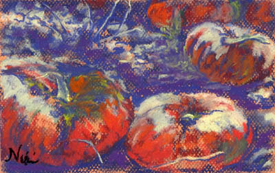
"Bitter Harvest" 6 x 9 inch Pastel on Paper Click here to view large or see purchase details One of the things I tend to mess up when using pastel is that I often lose my lights.  When I remember to be careful and maintain contrast, the outcome is usually much better. It took me a few years of working with pastel to realize that soft pastels layer in better dark to light.  I now know that it's important to save those lights for the end, and make sure they have plenty of room in my paintings.  Adding lights too early contributes to "mud," when colors blend together in a way that makes them look dull.  I still use up my lighter colored pastels much quicker than my dark ones-- a little dark pastel goes a long way, whereas the lighter colors need a few layers to really stand out.  Using a toothy pastel paper gives the light pastel something to grip, making it stand out even more. "Bitter Harvest II" 6 x 9 inch pastel on paper Click here to...
Harvest Time

Image
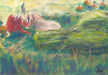
"Harvest Time" 9 x 12 Chalk Pastel on Paper Click here to purchase Back from a hiatus, and in the fall mood... I used good old Arches watercolor paper for this piece, and blended my chalks using water. The color scheme was supposed to be red, gold, and green based colors, but I had to add a bit of purple for emphasis. It's a scene from our trip last year to Lavender Hill Pumpkin Patch in Fallbrook. I always spend a little too much time hovering around the different types of pumpkinsand gourds, snapping as many photos as I can for later paintings. I guess you could say that I share my toddler's excitement when it comes to the sight of pumpkins. This was the first piece I painted in the last couple of weeks that I felt like sharing. I'd intended to paint through a trip up north and continue painting on return; unfortunately, it took me a while to jump back into my routine. Taking a break gave me a chance to get a fresh perspective on my art, and now I'm...