Primary colors at the beach
It's been a pretty dismal summer at the beach this year-- May Gray turned into June Gloom, which turned into July Sadness and Despair (couldn't think of anything to rhyme with July!)
So, I painted a warmer summer day at the harbor, using primary colors. I started with bright red paper that made my head throb, and knocked the red down to just a strip of water. This paper is extremely textured; you can see the texture through the pastel if you look close.
We do get "real" red tide, but if I were to paint that, it would be bright green (the color it lights up as during the night). If you've never seen red tide at night, it's pretty exciting-- just don't get it on your skin!
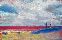 "Red Tide in Oceanside"
4.5 x 6 on Toned Paper
Prints available at RedBubble


Comments
Post a Comment