Posts

Number 4 of 10 Reasons to Love Pastel: Push-Pull
Image
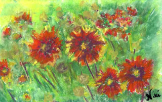
"Hippie Flowers" 6 x 9 inch pastel on drawing paper Click here to view large or see purchase details December usually isn't the best time for me-- everything seems to hit the fan mid-month, leaving me exhausted (and this time sick) by the time the holidays are over.  These little flowers cheered me up as I worked on them (I called them "Hippie Flowers" because they reminded me of something from the sixties). In spite of that, I've been working for a while on a few pieces to demonstrate one of my favorite elements of painting with pastel: the delicate push-pull between the soft, blended areas and the bolder, harder lines and strokes. One of the most relaxing things I can think of to do is to smear a pastel painting. In my first pastel classes, we learned to block in areas of color and smear the painting as a whole to achieve that soft background effect unique to pastel.  After a layer of fixative (if desired), we would then go back over the piece, a...
10 Reasons to Love Pastel: Soft Impressions

Image
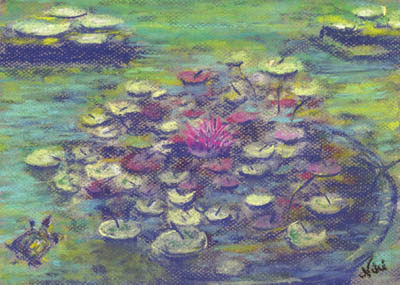
I believe I've made it to number five of my 10 reasons to love pastel: it's a natural choice for impressionists! "Balboa Turtle" 9 x 12 Pastel on Paper Click here to view large or see purchase details  If you're a fan of the Impressionist Movement, chances are you've enjoyed a few pieces created with pastel.  Pastel lends itself naturally to the quick strokes and dappled lights and darks of the impressionist style, and it's relatively easy to use in a plein air (outside) or alla prima (all in one session) painting setting.  The soft, smeary nature of dry pastel also makes it an ideal medium for paintings that focus on overall lights and darks without a lot of hard line and detail.  "Balboa Water Lilies" 9 x 12 Pastel on Paper Click here to view large or see purchase details   I was lucky enough to visit Musee D'Orsay  as a teenager (thanks to my generous host parents when I was an exchange student), and I couldn't w...

10 Reasons to Love Pastel: Lights and Shadows

Image
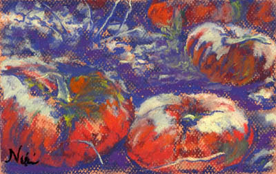
"Bitter Harvest" 6 x 9 inch Pastel on Paper Click here to view large or see purchase details One of the things I tend to mess up when using pastel is that I often lose my lights.  When I remember to be careful and maintain contrast, the outcome is usually much better. It took me a few years of working with pastel to realize that soft pastels layer in better dark to light.  I now know that it's important to save those lights for the end, and make sure they have plenty of room in my paintings.  Adding lights too early contributes to "mud," when colors blend together in a way that makes them look dull.  I still use up my lighter colored pastels much quicker than my dark ones-- a little dark pastel goes a long way, whereas the lighter colors need a few layers to really stand out.  Using a toothy pastel paper gives the light pastel something to grip, making it stand out even more. "Bitter Harvest II" 6 x 9 inch pastel on paper Click here to...

10 Reasons to Love Pastel: Texture!

Image
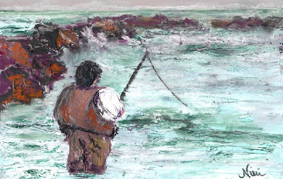
Reason #7 to love pastel: You can get great texture effects with it! "Fishin', Hopin', Prayin" 8 x 12 inch Mixed Media on Paper Click here to view large or see purchase details I always enjoy using a palette knife to create heavily textured paintings, but I enjoy the process even more when I finish the piece with a couple of layers of pastel (oil or soft pastel work great, but they each have different effects). Click here to view a tutorial on Empty Easel featuring the technique I used for this piece! For the piece above, I started with some photos I had taken on a cold afternoon at a crowded beach.  I wanted to capture the cold feeling of the day, so I used cool tones to create the water, painting in the strokes with a palette knife.  Once the acrylic dries, it's ready for the pastel, which can be scraped lightly over heavily textured parts or layered in as you would normally use pastel for the smoother areas of the piece.  Combining acrylic with p...

10 Reasons to Love Pastel: Color!

Image
"Beach Stroll" 9 x 12 Pastel on Paper Click here to view details It's a little easy to get drunk on color when using pastels.  When I first took pastel classes, it was difficult for me to stick to values when beginning a painting-- I always jumped into the bright colors (and quickly ended up in trouble).  Even now, if I'm having difficulty getting into painting mode, I can just open a box of brightly colored pastels and feel instantly inspired.  "Mermaid" 9 x 12 Pastel on Paper Click here to view details   Pastels come in a wide array of bright colors, and you don't have to do any mixing (although you can blend the colors if you wish).  Pastels hold their strong colors without fading for a long time, and there's no need to worry about cracking or drying out over time as there is with oil or acrylic. For me, the color sets the mood for a painting.  I know I can always use my trusty pastels to convey whatever mood I'm expressing w...

10 Reasons to Love Pastel: It Looks Great Over Watercolor!

Image
  "Abstract Flower" (View 1) 6 x 9 in. Pastel on Watercolor-Toned Paper Click here to see large or additional views     In the previous post, my number 10 reason for loving pastels was that they can be blended with water (chalk pastels in this case).    Now for number nine: You can use it over watercolor!   Another great technique for working with pastel is to tone some paper with watercolor, and create a dry pastel painting on the toned paper.  I did this in the piece above, using green watercolor on paper before working in the red, purple, and yellow-green tones with pastel.      Some tips for using watercolor as a surface primer for a pastel painting:   Vary the tones and values of the watercolor, so it creates an interesting background for your pastel.   Make sure the watercolor has plenty of time to dry completely before you start working with the past...

10 Reasons to Love Pastels: Just Add Water

Image
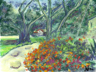
Well, in honor of being almost to my 200th post on this blog, I thought I'd do a series: 10 Reasons to Love Pastels. Since I spend most of my time scrubbing chalk into my paintings, I'll be focusing on chalk pastels for these posts, and how I've learned to love so many things about them over the last (gulp) nine years of painting with soft pastel. Reason #10 to love soft pastels: they can be blended with water! "Down at the Oaks" 9 x 12 Chalk pastel on watercolor paper Click here to view large or purchase Chalk pastels are easy to blend with water, by taking a dry pastel painting (on watercolor paper or canvas) and brushing with water.  Click here to see a detailed tutorial on using this method. You can also paint with wet pastel sticks directly on canvas, or press dry pastel sticks onto a wet paper or canvas to get a unique effect: "The Road to Reno" 9 x 12 Chalk pastel on flat canvas Click here to view large or purchase There are d...