Posts

10 Reasons to Love Pastel: Texture!

Image
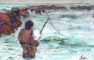
Reason #7 to love pastel: You can get great texture effects with it! "Fishin', Hopin', Prayin" 8 x 12 inch Mixed Media on Paper Click here to view large or see purchase details I always enjoy using a palette knife to create heavily textured paintings, but I enjoy the process even more when I finish the piece with a couple of layers of pastel (oil or soft pastel work great, but they each have different effects). Click here to view a tutorial on Empty Easel featuring the technique I used for this piece! For the piece above, I started with some photos I had taken on a cold afternoon at a crowded beach.  I wanted to capture the cold feeling of the day, so I used cool tones to create the water, painting in the strokes with a palette knife.  Once the acrylic dries, it's ready for the pastel, which can be scraped lightly over heavily textured parts or layered in as you would normally use pastel for the smoother areas of the piece.  Combining acrylic with p...

10 Reasons to Love Pastel: Color!

Image
"Beach Stroll" 9 x 12 Pastel on Paper Click here to view details It's a little easy to get drunk on color when using pastels.  When I first took pastel classes, it was difficult for me to stick to values when beginning a painting-- I always jumped into the bright colors (and quickly ended up in trouble).  Even now, if I'm having difficulty getting into painting mode, I can just open a box of brightly colored pastels and feel instantly inspired.  "Mermaid" 9 x 12 Pastel on Paper Click here to view details   Pastels come in a wide array of bright colors, and you don't have to do any mixing (although you can blend the colors if you wish).  Pastels hold their strong colors without fading for a long time, and there's no need to worry about cracking or drying out over time as there is with oil or acrylic. For me, the color sets the mood for a painting.  I know I can always use my trusty pastels to convey whatever mood I'm expressing w...

10 Reasons to Love Pastel: It Looks Great Over Watercolor!

Image
  "Abstract Flower" (View 1) 6 x 9 in. Pastel on Watercolor-Toned Paper Click here to see large or additional views     In the previous post, my number 10 reason for loving pastels was that they can be blended with water (chalk pastels in this case).    Now for number nine: You can use it over watercolor!   Another great technique for working with pastel is to tone some paper with watercolor, and create a dry pastel painting on the toned paper.  I did this in the piece above, using green watercolor on paper before working in the red, purple, and yellow-green tones with pastel.      Some tips for using watercolor as a surface primer for a pastel painting:   Vary the tones and values of the watercolor, so it creates an interesting background for your pastel.   Make sure the watercolor has plenty of time to dry completely before you start working with the past...

10 Reasons to Love Pastels: Just Add Water

Image
Well, in honor of being almost to my 200th post on this blog, I thought I'd do a series: 10 Reasons to Love Pastels. Since I spend most of my time scrubbing chalk into my paintings, I'll be focusing on chalk pastels for these posts, and how I've learned to love so many things about them over the last (gulp) nine years of painting with soft pastel. Reason #10 to love soft pastels: they can be blended with water! "Down at the Oaks" 9 x 12 Chalk pastel on watercolor paper Click here to view large or purchase Chalk pastels are easy to blend with water, by taking a dry pastel painting (on watercolor paper or canvas) and brushing with water.  Click here to see a detailed tutorial on using this method. You can also paint with wet pastel sticks directly on canvas, or press dry pastel sticks onto a wet paper or canvas to get a unique effect: "The Road to Reno" 9 x 12 Chalk pastel on flat canvas Click here to view large or purchase There are d...

Remember Narnia?

Image
"Bowing Oak" 9 x 12 inch Chalk pastel on flat canvas Click here to view large or purchase There are many sights that inspire artists here in Fallbrook.  Live Oak Park is both a wonderful location for families and a great place to take in the play of light and shadow on the trees. As a child, I remember enjoying the twists and turns of the park and the large, shady areas to run wild with other kids.  As an adult who likes to paint trees, I have a whole new appreciation for the park.  The tree in the painting above inspired me both from an artist's and a child's point of view.  It reminded me of the dryads in one of my favorite childhood book series, The Chronicles of Narnia .  Although I enjoy the Narnia movies, my memories of the books are much stronger, and one of the scenes I often think of when I see such lifelike trees is when Susan and Lucy happened upon the Dryads dancing in the moonlight. "Bowing Oak" was created with my favorite ...

Road Trip!

Image
"Sierra Slopes" 8 x 10 inch Chalk and Oil Pastel on Flat Canvas Click here to view prints I learned a few things on a recent trip up highway 395. Babies can only handle so much time in a carseat (especially on the way home.  It's like they know ). My phone can take focused pictures through glass at high rates of speed (not above the speed limit, of course).  There might be some reflections on the photo, but I can edit those out as needed. A long car trip is much more tolerable if you look at the scenery as potential paintings. Not all McDonald's bathrooms are created equal. Once I got home, I flipped through my photo gallery on my phone and was pretty excited about what I had.  As I worked on this painting, I did a little thinking about the benefits of using flat canvas for pastels: Less prep work: no paper, board, tape required! Nice toothy, textured surface (not great if you like that velvety smooth look, though) Lightweight, easy to handle ...

Inspiration Photos and Making Friends with Fixative

Image
"Old Temecula Field" 12 x 16 in Pastel on flat canvas (oil/chalk) Click here to view large or purchase I started with a photo from my phone (it takes pretty amazing pictures if the light's right).  I took the photo behind Pat and Oscar's restaurant in Temecula, because between the clouds, the light, and the open field, I felt like I was catching a glimpse of my childhood.  We moved to the area in the late '80's, back before it had any stoplights (or malls, or SUV's).  I remember the thrill of being allowed to walk home with my friends who lived close to school, tromping through empty fields to get to their houses. As you can see, I can't really call this a reference photo, as it's quite different from the painting.  It was definitely an inspiration though, and I did refer back to it for some of the values and composition.  I actually started the piece with a layer of blue acrylic before adding in an oil pastel underpainting.  I then work...