Posts

Cat on a Hot Color Palette

Image
                                                   "Cat Pose 1" 5 x 8 in Chalk pastel and watercolor on paper Click here to view Etsy listing "Cat Pose 2" 5 x 8 in Chalk and watercolor on paper Click here to view Etsy listing Another heat wave in San Diego county... at this point, I've accepted the fact that I'm going to be hot and miserable until my second child arrives.  So, in between painting sessions on a bigger acrylic piece, I took the time to play with some hot colors and loose cat figures.  We have a couple of cats who are quite, ahem, large, and when they pose I like to take pictures of their forms for later exercises.       I don't use this color scheme often, but I always like it ...

Keep the Mess, Reach Success

Image
"Almond Blossoms" 9 x 12 Chalk Pastel on Paper Click here to view large or purchase There are times when it's hard to work in the face of a mess.  When faithfully making daily paintings, I had a little monthly ritual that consisted of collecting all of the works I'd completed for the month and packing them away.  It gave me a chance to clear my mind and start fresh. These days, I have to work in small spurts on several projects at a time.  When my energy is low (which is most of the time, as I have a baby due next month), the task of cleaning everything up and putting it away each time I work becomes a little daunting.  So, I've decided that it's ok to leave the painting messes out for a while until a piece is finished.  This means having several stations to work, with materials ready and works in progress displayed where I can see them throughout the day.  The pieces I'm sharing today took longer than planned to complete, as I kept gett...

Oceanside Summer

Image
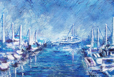
"Harbor Alley" 14 x22 Mixed Media on Paper Click here to purchase or view large This piece took a while, as it was a bit of an experiment but turned into quite an exercise. We've had some great weather over the summer down at Oceanside Harbor, so I've been wanting to capture some of those bright days in my artwork.  I started with a palette knife painting using blue acrylic and gesso, laying in the values and basic composition before I broke out the chalk. I ended up layering chalk over acrylic, then more paint over the chalk again to bring back some of those deep blues and bright whites.  The goal of the painting was not to show what the actual boats looked like, but the patterns of horizontal and vertical shapes highlighted by the bright sun and set against the darker water. In the spirit of summer and great beach weather, I also did a pastel painting of my daughter as she looked last year: "Little Chunky Thighs on the Beach" 9 x 12 Chalk p...

Rescuing a Painting

Image
"Pangaea" 14 x 18 in. Acrylic and oil pastel on flat canvas Click here to purchase (or see large) Some months back, I began a painting with acrylic (using a palette knife) on some flat canvas.  I blocked in the large forms and basic lights and darks with the knife, and liked the simplicity of the first stage. I tried some chalk pastel over the acrylic, to highlight the thick textures and brighten the piece.  I had put a great deal of yellow chalk over the paint, liking the brightness but unsure that it felt right. Then I got sick.  Brutally, miserably sick with nausea for a couple of months.  Every time I looked at the painting, I didn't like the color choices I had made (all that yellow began to take on a sickly feel with the green and purple).  Finally, I put it away, because looking at it reminded me of how sick I had gotten when I was in the middle of working on it. I didn't forget about it though.  I knew it had started off strong, and that...

Slow and Steady

Image
"How 'bout a Hug" 9 x 12 Chalk pastel on paper Click here to purchase Caught these two turtles in a cute moment at the duck pond in Temecula... Not feeling well really puts a damper on the creative process!  I painted this piece mostly in one session, then had a rough few days where I didn't feel well enough to finish it up.  It's easy to start panicking when periods of time like that set in, but I've learned a trick as I've gotten older and more patient: even baby steps will eventually get you where you need to go. If I felt good enough to sit up and work, I added a little touch here and there to get the piece done: a bit of shading on the shell, more depth in the water, or light smears on the rock.  Having been used to completing five or more paintings a week, finishing just one doesn't sound like much.  It's better than not painting at all, or trying to push out a lot of paintings that end up in the failure pile.  I try to remember th...

Water, Water Everywhere

Image
"View from the Jetty" 9 x 12 Chalk Pastel on Paper Click here to purchase I took the photo that inspired this painting last year, on a cold day at the beach.  I didn't get around to painting it until this year, on an extremely hot day at home. Looking around at the finished pieces and works in progress sitting around my kitchen, I realized that every one of them had a common element: water.  Even my landscapes have a bit of water in them.  I thought back to my high school days, when I first really tried to make paintings of my own.  I remembered that they usually had some water or waves in them too. I don't live near water, but it's not too far to drive to the beach.  I'm also happy to paint swimming pools, ponds, and lakes.  I'm not sure what it is about water, but a painting feels much more comfortable to me if it has some in it.  One thing I've learned about painting all these water scenes is the importance of shadow under the light....

Creating the Mood

Image
"Evening" 9 x 12 Mixed media on paper Email nicolehilsabeck@yahoo.com if interested in purchasing A week ago, it was so cold at a Fourth of July event that we were shivering with sweaters on.  This week, the weather has turned... Dreaming of cool evenings, I took out the oil pastels and sketched in a tree, Then I added a little bit of sky and water.  I really just wanted to give myself a color exercise, but it turned into a full painting. After I filled the paper with a full oil pastel underpainting, I used light watercolor as a wash to fill in color over some of the whites.  Once that was dry, a layer of chalk pastel completed the piece, giving it that soft, textured look.  I stuck to a lot of blue and purple, using a bit of green to suggest the leaves of the tree and the grass.  A little red and yellow-orange in the clouds lent a bit of warmth and variety. I used Strathmore watercolor paper, which holds up pretty well for mixed media piece...